Épuisé
En savoir plus sur le livre
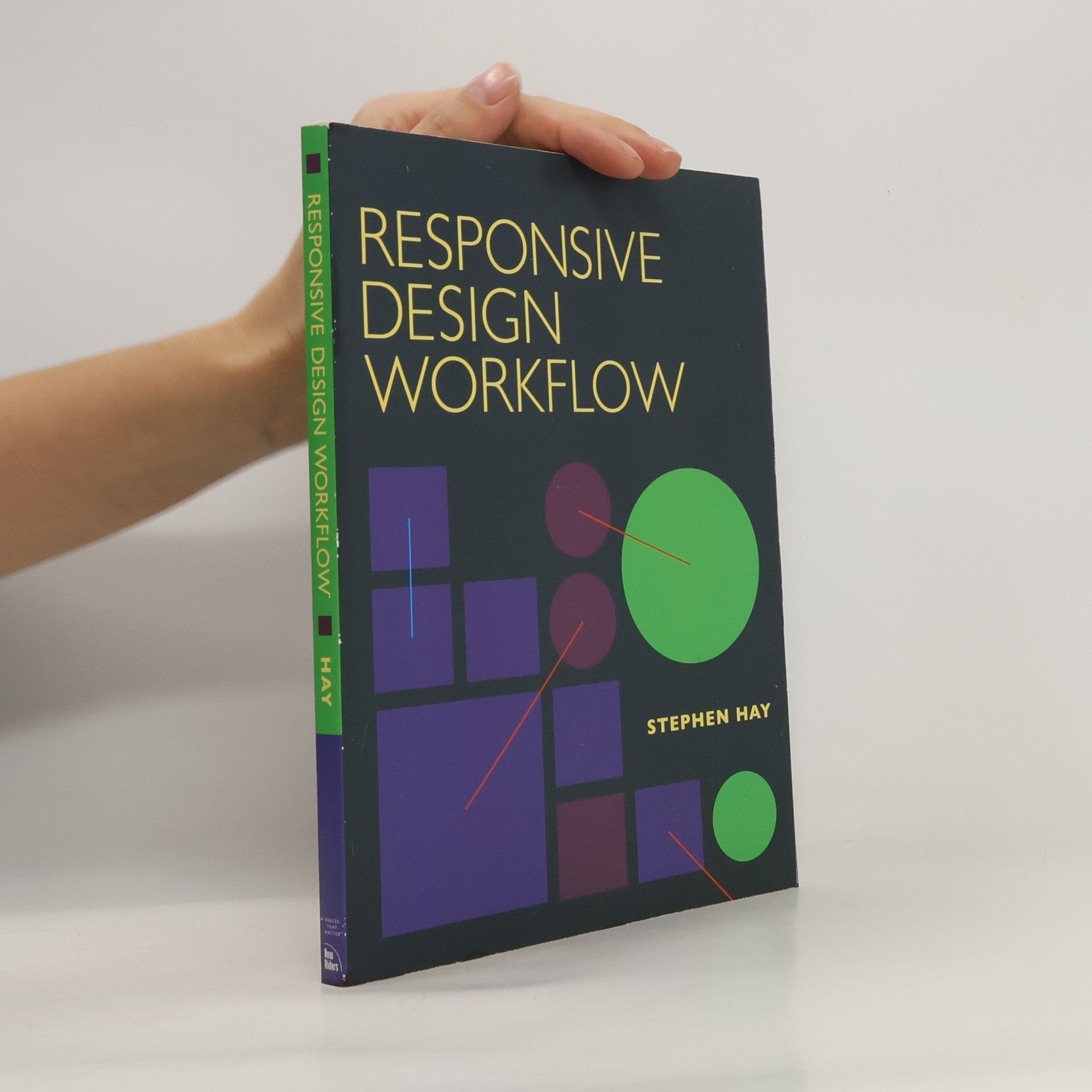
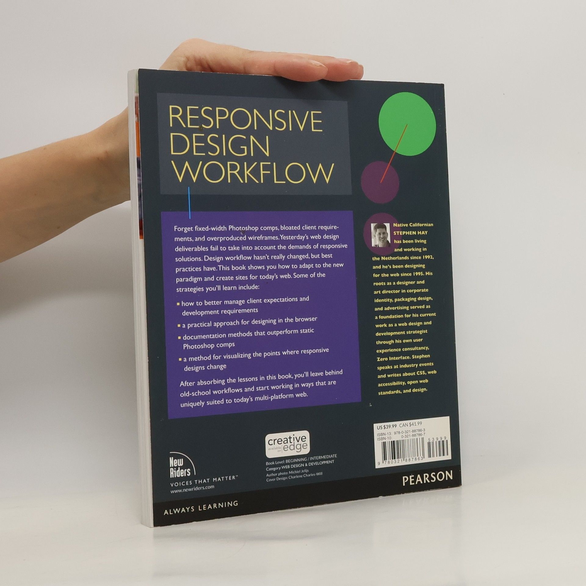
In our industry, everything changes quickly, usually for the better. We have more and better tools for creating websites and applications that work across multiple platforms. Oddly enough, design workflow hasn't changed much, and what has changed is often for worse. Old-school workflow is simply not effective on our multiplatform web. Fixed-width Photoshop comps and overproduced wireframes are no longer the way to design for today's multi-platform web. This book provides a practical approach for "designing in the browser." It shows how to better manage client expectations and development requirements, and offers a method of design documentation.
Achat du livre
Responsive design workflow, Stephen Hay
- Langue
- Année de publication
- 2013
- product-detail.submit-box.info.binding
- (souple)
Nous vous informerons par e-mail dès que nous l’aurons retrouvé.
Modes de paiement
Personne n'a encore évalué .


