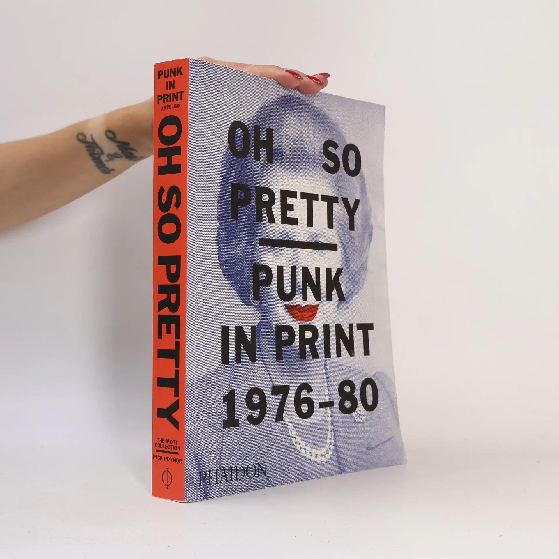
Plus d’un million de livres disponibles en un clic !
Bookbot

Rick Poynor

    Rick Poynor est un écrivain britannique axé sur le design, le design graphique, la typographie et la culture visuelle. Son travail explore les implications culturelles de la communication visuelle, abordant des thèmes tels que la publicité, la photographie, le branding et le design commercial. Les livres de Poynor couvrent à la fois la critique culturelle et l'histoire du design, se concentrant souvent sur des figures clés et des tendances générales du design graphique et de la typographie. Son écriture se distingue par une analyse critique du postmodernisme et de la typographie numérique.

    Why Graphic Culture Matters
    Typography Now
    Typographica
    No More Rules
    Obey the giant
    David King
    • David King

      Designer, Activist, Visual Historian

      • 240pages
      • 9 heures de lecture
      4,8(5)Évaluer

      David King's career spanned journalism, graphic design, photography, and activism, marked by a profound interest in revolutionary Russia. Starting at the Sunday Times Magazine in the 1960s, he became known for his image-led journalism and amassed a collection of around 250,000 images. King's work included creating impactful anti-Apartheid and anti-Nazi posters, album covers for iconic bands, and catalogues on Russian art. This publication highlights his multifaceted legacy as a visual historian and artist, showcasing his contributions to political and cultural discourse.

      David King
    • Obey the giant

      • 224pages
      • 8 heures de lecture
      4,2(50)Évaluer

      In the 21st century, commerce and culture are ever more closely entwined. This collection of essays by design critic Rick Poynor takes a searching look at visual culture to discover the reality beneath the ultra-seductive surfaces. Poynor explores the thinking behind the emerging resistance to commercial rhetoric among designers, and offers critical insights into the changing dialogue between advertising and design. Other essays address the topics of visual journalism; brands as religion; the new solipsism; graphic memes; the pleasures of imperfect design; and the poverty of “cool”. The worldwide dominance of huge corporations is invariably expressed by visual means. This book challenges this mono-culture critically. It offers inspirational evidence of alternative ways of engaging with design, and it will appeal to any reader with a questioning interest in design, advertising, cultural studies, media studies, and the visual arts.

      Obey the giant
    • No More Rules

      • 192pages
      • 7 heures de lecture
      4,2(150)Évaluer

      The last twenty-five years have seen profound changes in the field of graphic communication. One by one, the old certainties about the techniques and pruposesof graphic design have been questioned and torn apart. With the international take-up of the new technology in the 1990s, there was an explosion of creativity in graphic design, as designers and typographers reassessed their role, jettisoned existing rules and forged experimental new approaches. Graphic work became more self-expressive, idiosyncratic and sometimes extreme. No More Rules tells this story in detail, breaking down a broad and sometimes confusing field of graphic design activity into key developments and themes, such as the American new wave; punk and its aftermath; deconstructionist theory and design; the digital type revolution; typography grunge; graphic authorship and graphic agitation; retro and the vernacular; and recent new conceptual approaches to design. Each theme is illustrated by significant examples of work produced between 1980 and 2000 that have changed the way in which designers and their audiences think about graphic communication.

      No More Rules
    • Typographica

      • 144pages
      • 6 heures de lecture
      3,9(11)Évaluer

      The magazine Typographica--brainchild of founder, editor, designer, and renowned typographer Herbert Spencer--had a brief life, a total of 32 issues published over nineteen years. But its influence stretched--and stretches--far beyond its modest distribution and print runs of the time. Indeed, for many graphic designers, Typographica is something of an obsession, to be collected if and when found, savored, and poured over for designs and techniques not seen since.Remarkably, Spencer never intended to turn a profit, so no expenses were spared in the making of the magazine. Different papers, letterpress, tip-ins, and more were all employed in the presentation of an eclectic range of subject Braille, locomotive lettering, sex and typography, typewriter faces, street lettering, matches, and avant-garde poetry all found their way into the magazine.Rick Poynor, founding editor of Eye, recreates the excitement of Typographica in this carefully researched, accessibly written, and beautifully illustrated book that pays tribute to the man and the magazine that changed the course of graphic design.

      Typographica
    • Typography Now

      The Next Wave

      • 256pages
      • 9 heures de lecture

      "Guide to the new experimental typography"--Back cover.

      Typography Now
    • Oh so pretty

      • 511pages
      • 18 heures de lecture

      A compelling visual portrait of a time, place, and subculture that raised a middle finger to modern society Oh So Pretty: Punk in Print 1976-80 is an unrivalled collection of visually striking ephemera from Britain’s punk subculture. It presents 500 artefacts - 'zines,' gig posters, flyers, and badges - from well-known and obscure musical acts, designers, venues, and related political groups. While punk was first and foremost a music phenomenon, it reflected a DIY spirit and instantly recognizable aesthetic that was as raw and strident and irrepressible as the music. As disposable as the items in this book once were, together they tell a story about music, history, class, and art, and document a seismic shift in society and visual culture.

      Oh so pretty
    • Anarchie der Zeichen

      • 192pages
      • 7 heures de lecture
      4,0(1)Évaluer

      Anarchie der Zeichen ist ein kritischer und systematischer Uberblick uber die grafische Revolution der letzten 20 Jahre, in welcher sich Grundlegendes geandert hat. Die Entwicklung begann schon in den fruhen 80er Jahren, als der Mac allgegenwartiges Arbeitsinstrument wurde. Mit seiner internationalen Verbreitung in den 90ern beschleunigte sich diese Entwicklung und fuhrte zu einer kreativen Explosion im Grafik-Design: Designer und Typographen warfen bestehende Regeln uber Bord und gingen neue experimentelle Wege. Grafik-Design diente zuweilen mehr der Selbstdarstellung, wurde ubertrieben, sogar extrem. Anarchie der Zeichen rekonstruiert die wichtigsten Entwicklungen und Themen dieser Geschichte unter Begriffen wie Ursprunge, Dekonstruktion, Aneignung, Techno, Autorschaft, Opposition. Es schlusselt so das weite und facettenreiche Feld des zeitgenossischen Grafik-Designs auf und ist eine einzigartige Quelle fur Fachleute und Lehrende, Studenten, Werbefachleute und bildende Kunstler.

      Anarchie der Zeichen