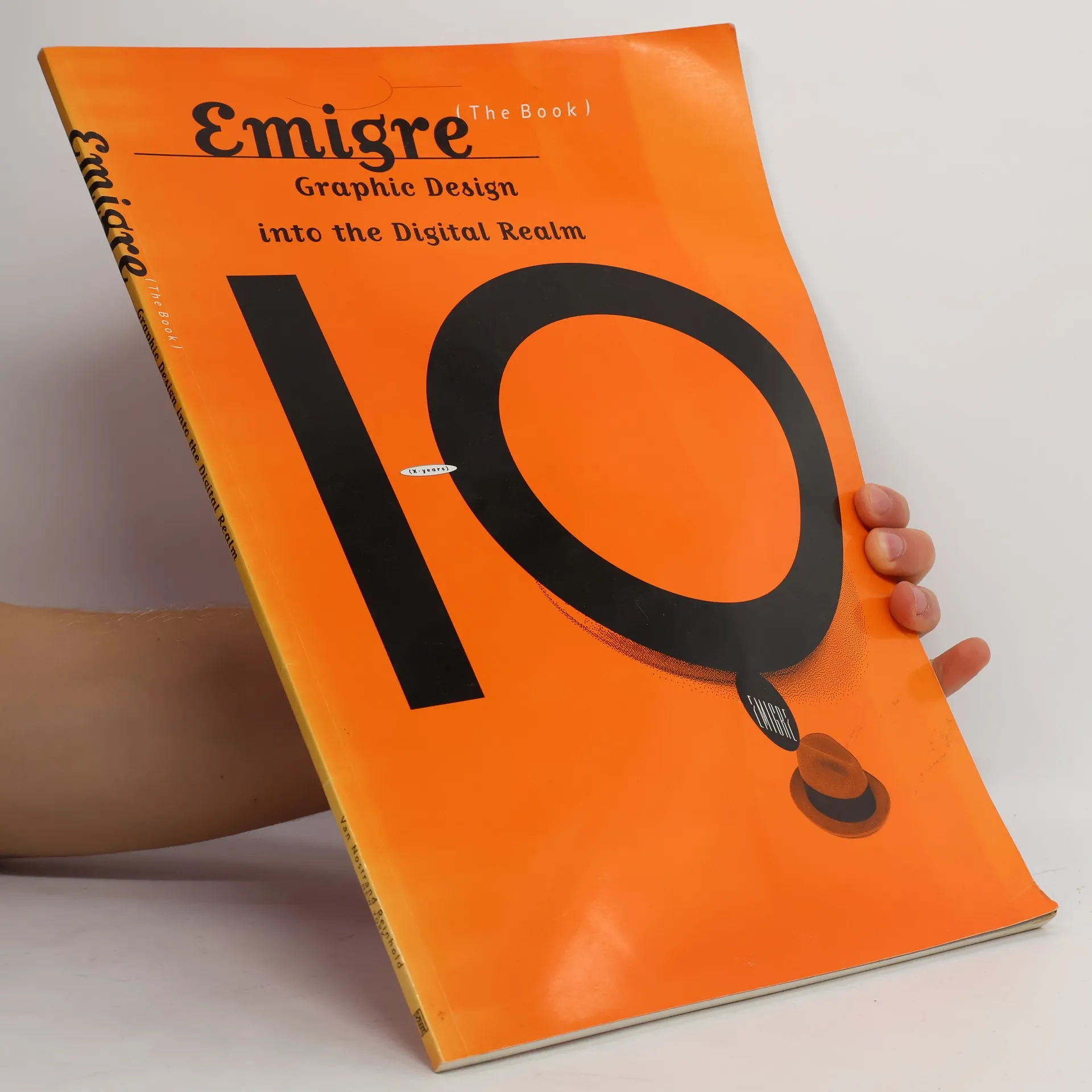
Plus d’un million de livres à portée de main !
Bookbot

Rudy VanderLans

    This Vehicle Makes Frequent Stops
    Oleander Sunset
    Supermarket
    Still Lifes, Tokyo
    If We're Standing on the Shoulders of Giants, what are We Reaching For?
    Emigre No. 70
    • Emigre No. 70

      The Look Back Issue. Selections from Emigre Magazine 1-69, 1984-2009

      • 512pages
      • 18 heures de lecture
      4,4(26)Évaluer

      During the late 1980s and throughout the 1990s, graphic design was experiencing one of its most exciting and transformative periods. The Apple Macintosh computer had been introduced, design schools were exploring French linguistic theory, the vernacular had become a serious source of study and inspiration, the design and manufacture of typefaces was suddenly opened up to everyone who could use a computer, and for the first time in the United States, New York City was no longer the place to look for the latest developments in graphic design. And in Berkeley, California, across the bay from Silicon Valley, Emigre magazine, like no other, recognized the significance of the events, and became both a leading participant and a keen observer of this innovative international design scene, generating a body of work and ideas that still resonate today. Fueled by Emigre's successful digital type foundry, the magazine became one of the most popular and controversial graphic design magazines of its time. 69 issues were published in a variety of formats, featuring in-depth interviews with fellow design trailblazers and critical essays by an emerging group of young design writers. This book, designed and edited by Emigre co-founder and designer Rudy VanderLans, is a selection of reprints, using original digital files, tracing Emigre's development from its early bitmap design days in the late 1980s through to the experimental layouts that defined the so called "Legibility Wars" of the late 1990s, to the critical design writing of the early 2000s. Emigre No.70 is a must have book for those who missed out on all the excitement the first time around and for those who have been long time Emigre fans alike. Any graphic design library would be incomplete without it. Featuring interviews with, among others, The Designers Republic, Allen Hori, Rick Valicenti, Vaughan Oliver, Mr. Keedy, Ed Fella, and essays by Lorraine Wild, Anne Burdick, Zuzana Licko, Kenneth FitzGerald, Andrew Blauvelt, Kalle Lasn, Rick Poynor and many more

      Emigre No. 70
    • For almost twenty years, and over sixty issues, Emigre has been a sourcebook of ideas, fonts, images, work, products, and even music for an entire generation of designers. Now, Emigre has transitioned into a new format, a return-to-roots series of "pocketbooks, " focusing on critical writing about the state of graphic design. Anyone interested in contemporary design will want to put a copy of Emigre in their pocket.

      If We're Standing on the Shoulders of Giants, what are We Reaching For?
    • Still Lifes, Tokyo

      • 256pages
      • 9 heures de lecture
      3,5(2)Évaluer

      The third book in the Still Lifes series features over two hundred photos taken in Tokyo, showcasing the city's unique details through a lens of stillness and motion. Rudy VanderLans captures a rarely seen Tokyo, devoid of human figures, while thoughtfully arranging images that often mirror each other despite differing subjects.

      Still Lifes, Tokyo
    • Supermarket

      • 176pages
      • 7 heures de lecture
      4,0(5)Évaluer

      On the outskirts of civilization, where suburban man stumbles over nature, an untold drama is taking place. A relentless effort by present day frontiersmen to tame and overcome the inhospitable California desert. Rudy VanderLans takes us to the heart of this spectacle, where suburban elements meet vacuous space, where dubious claims of commerce stand fragile against a harsh light, where contemporary dwellers impose incongruous notions of luxury on a magnificent wilderness landscape. Supermarket captures the folly and the beauty of this colorful drama in all its ambiguity, with astounding photographic spreads that come at us like film, taken at slightly different angles, juxtaposed or duplicated in singularly bold symmetry. The iteration of the images so leveraged simulates a spatiality that transcends the ordinary two-dimensional page. Supermarket is a disturbingly beautiful book that takes us on a poetic journey through VanderLans' California, documenting our sometimes successful, sometimes futile attempt to transform an unfriendly environment into a bearable, happy land. Rudy VanderLans, co-founder and editor of 'Emigre' magazine, brings us inside this desert environment in small steps, taking us along the California coast heading south and then east through the built environment, setting the scene for our final destination.

      Supermarket
    • Oleander Sunset

      • 256pages
      • 9 heures de lecture

      Inspired by artists like Edward Curtis and Charles Schulz, who devoted their lives to a single objective, Rudy VanderLans continues his pursuit to create a consistent body of work of postcard-size images, rendering a comprehensive portrait of California in the early part of the 21st century. VanderLans, who is often drawn to places with fantastical names -- like Oleander Sunset --wanders about California's back roads with eyes wide open. Without theorizing, or searching for subjects, he allows himself to be receptive to the world around him and discovers beauty in the most ordinary locales. Like the men who named the cities and towns he visits, VanderLans makes the mundane seem less so, and in the process shows us what's been overlooked. Oleander Sunset juxtaposes single images on opposing pages, setting up dynamic formal and contextual interactions through contrasting, complementing and reiteration. The book is interspersed with a number of fold-out panoramas, placing the viewer smack in the middle of the author's habitual stamping ground.

      Oleander Sunset
    • Upon his arrival in the United States some 36 years ago, Rudy VanderLans embarked on a pan-American trip in a Greyhound bus from New York to California. Overwhelmed by the experience, he rarely took out his camera, feeling unprepared for the challenge to capture and do justice to the visual overload of the American environment. In 2016 he set out to retrace his route, this time with camera in hand and a determination to record the experience.

      Still Lifes, U.S.A.
    • Emigre Fonts

      • 752pages
      • 27 heures de lecture

      In 1985, Berkeley-based graphic design company Emigre, the publisher of the legendary design magazine of the same name, launched one of the first independent digital type foundries to explore the new design possibilities offered by the MacIntosh computer. To announce each of their new typeface releases, Emigre published small booklets displaying the virtues of the fonts and revealing the processes used to design them. By creating specific contexts, many of these so called?type specimens? went beyond being simple sales tools. In fact the Emigre booklets were meant to be enjoyed as much for the typefaces as for their esoteric content. 00Emigre broke rules and raised eyebrows, winning them both world-wide acclaim and much criticism. Ultimately, Emigre?s typefaces came to define an era. They were one of the first digital type foundries to sell typefaces online, and they created the model for hundreds of small foundries who followed in their footsteps. Five of Emigre?s digital typefaces were included in MoMAs permanent design collection. The type specimens featured in this book are a selection of some of Emigre?s most memorable productions of the past 30 years

      Emigre Fonts
    • Emigre

      • 96pages
      • 4 heures de lecture

      Presents a decade of Mac-inspired iconoclasm from one of America's most controversial design magazines.

      Emigre